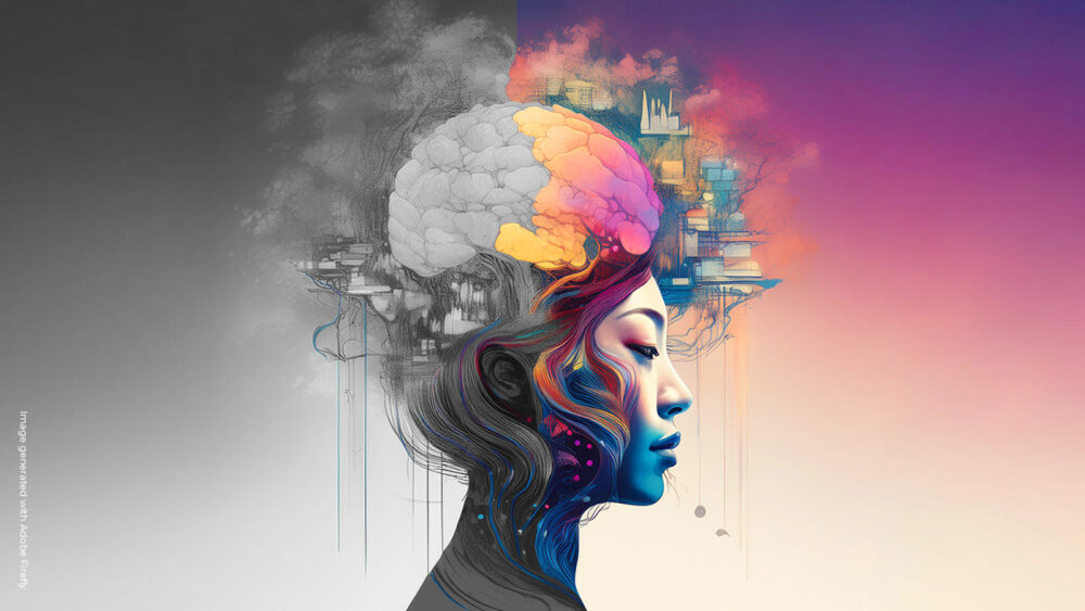
In the ever-evolving landscape of graphic design, a new player is making its mark: Neuroaesthetics. This emerging field, which blends neuroscience and aesthetics, is revolutionizing how we approach design by focusing on how our brains respond to visual stimuli. For marketing strategists and design specialists, understanding and applying Neuroaesthetics can lead to more impactful and emotionally resonant designs.
Neuroaesthetics explores how visual elements like shapes, colors, patterns, and symmetry affect our emotions and decision-making processes. By leveraging these insights, designers can craft visuals that not only look appealing but also evoke specific emotional responses.
The Buzz about Neuroaesthetics
The excitement around Neuroaesthetics in the creative industry stems from its potential to transform how we design. It’s not just about aesthetics; it’s about creating designs that resonate deeply with viewers, influencing their emotions, decisions, and behaviors. This approach offers a scientific basis for the art of design, making it both an art and a science.
The extensive study by Design Hotels, “Neuroaesthetics–Design for the Mind,” offers a comprehensive guide and future forecast that demonstrates the deep connection between design and human nature. This study provides newfound knowledge on how design impacts behavior and well-being, serving as a valuable resource for designers looking to integrate Neuroaesthetics into their work.
For those intrigued by the interplay between neuroscience and design, “Beyond Five Senses” by Robyn Landau and Katherine Templar-Lewis is a perfect companion. This audiobook explores how our senses shape our perceptions and emotional responses, providing deeper insights into the principles of Neuroaesthetics discussed in our article. It’s an enlightening listen that can enhance your understanding of how design impacts human behavior and emotions.
Implementing Neuroaesthetics in Daily Creative Work
Embrace Symmetry and Patterns
Symmetry and patterns are inherently pleasing to the human brain. They create a sense of order and predictability, which can be calming and reassuring. For example, the architectural design of the Guggenheim Museum in New York, designed by Frank Lloyd Wright, employs circular patterns and symmetrical shapes. These elements contribute to a harmonious and aesthetically pleasing environment that draws visitors in and encourages them to explore the space comfortably.
Play with Colors
Colors have powerful effects on our emotions. Warm colors like red and orange can evoke energy and excitement, while cool colors like blue and green can create a sense of calm and relaxation. For instance, the Google retail store design incorporates vibrant colors that make the space feel welcoming and playful. Additionally, the interior design of the store uses natural colors and sustainable materials, such as cork and wood furniture, creating a sense of connection with nature, which is important in Neuroaesthetics. These natural colors make people feel grounded and at ease, enhancing the overall emotional experience of the space.
Successful Examples of Neuroaesthetics in Branding and Advertising
Deutsche Bank Logo
Like well-known brands such as Nike, Apple, and CNN, the Deutsche Bank logo, designed by Anton Stankowski, is a prime example of Neuroaesthetics in branding. The logo, which recently turned 50 years old, features a blue square with a diagonal line, symbolizing dynamic growth in a stable environment. The simplicity and symmetry of the design evoke feelings of stability and trust. The blue color is associated with calmness and reliability, making the logo not only visually appealing but also emotionally reassuring.
Empowering Print Campaigns
A compelling print campaign that exemplifies Neuroaesthetics is Amnesty International’s “Pain-Tings” campaign. Launched in 2020 and still highly regarded in 2024, this campaign utilized famous artwork to make a powerful statement against domestic violence and violence toward women. By altering iconic paintings to include bruises and wounds on the subjects, the campaign highlights the issue of violence against women. The use of art and its educational value creates a shocking yet memorable impact, engaging viewers emotionally and sparking global conversation on this critical issue. This campaign is a good example because it focuses entirely on emotion and how it makes us feel, leveraging the shock factor to drive its message home.
Remember Dove’s “Real Beauty” campaign? This campaign also focuses entirely on emotion, showcasing posters and billboards with women of various ages, sizes, and ethnicities, celebrating natural beauty. The use of clean, white backgrounds and soft, natural lighting highlights the authenticity and diversity of the models. The campaign’s simplicity, coupled with its powerful message of empowerment and self-acceptance, resonates deeply with viewers, making them feel seen and appreciated. Again, it is how it makes us feel that counts.
Patagonia Website
The Patagonia website is an excellent example of Neuroaesthetics in digital design. Patagonia incorporates biophilic design principles, using elements of nature to evoke feelings of well-being and connection. The use of earthy colors, natural textures, and imagery of outdoor landscapes aligns perfectly with Patagonia’s adventurous and environmentally conscious audience. This design approach not only enhances the user experience but also strengthens the emotional connection between the brand and its customers.
Tips for Applying Neuroaesthetics in Your Next Design Project
- Prioritize Coherence and Simplicity: Create designs that are easy to understand and navigate. Coherence and simplicity help the brain process information more efficiently, leading to a more pleasant experience.
- Engage Multiple Senses: Incorporate elements that engage multiple senses. Textures, sounds, and scents can enhance the visual experience, creating a more immersive and memorable interaction.
- Design for Emotion: Think about the emotions you want to evoke with your design. Use elements like color, shape, and composition to craft visuals that resonate emotionally with your audience.
- Research Color and Shape Psychology: Use resources to understand how different colors and shapes influence emotions and behaviors. Make sure the elements you use evoke the intended emotion.
- How Does It Make You Feel?: Test your creation with other people to ensure it evokes the desired emotions. Gathering feedback can help refine your design to better connect with your audience.
The Future of Neuroaesthetics
Neuroaesthetics is poised to become a central pillar in the design process, offering new tools and insights for creating emotionally impactful designs. As research in this field continues to grow, we can expect to see more applications of neuroaesthetic principles in everything from branding and advertising to architecture and urban planning.
By embracing Neuroaesthetics, designers can create visuals that not only look good but also feel good, fostering deeper connections and positive emotional responses. This approach heralds a new era in design, one that aligns beauty with well-being and human flourishing.
In summary, Neuroaesthetics offers a compelling framework for understanding and enhancing the impact of design on human emotions and behaviors. By integrating these principles into our creative processes, we can create more meaningful, resonant, and impactful designs that enrich our lives and the world around us.


Comments are closed.