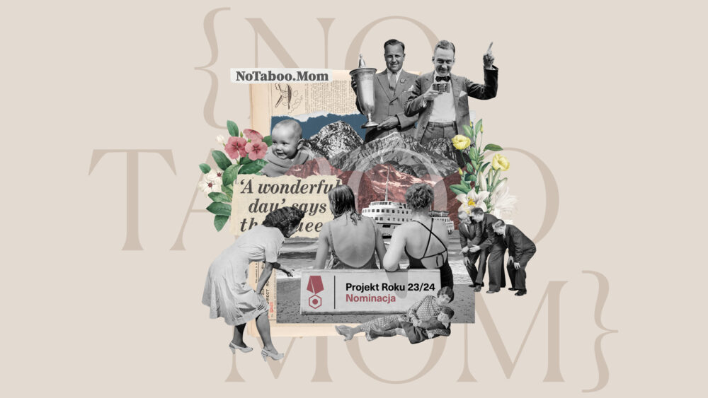
We are honored and thrilled to announce that No Taboo Mom has been nominated for the “Project of the Year” in the Impact category by STGU (Stowarzyszenie Twórców Grafiki Użytkowej), the Association of Applied Graphic Designers in Poland. This recognition from STGU signifies a monumental achievement, highlighting the dedication, passion, and impact that No Taboo Mom continues to make in the realm of womanhood and motherhood.
About STGU and the ‘Project of the Year’ Award
STGU, the Association of Applied Graphic Designers in Poland, is known for organizing the prestigious “Project of the Year” competition. It is the first graphic design competition in Poland that looks beyond aesthetics, focusing on the functions of design and the social responsibility of creators. Annually, it reviews the most groundbreaking works in graphic design, celebrating projects that align with its core values. Categories include Idea, Form, Impact, Sustainable Design, Institutions, Fresh Blood, and AI as a Tool. To be recognized by STGU is to be acknowledged not just for visual design but for contributing to social conversations and effecting positive change.
No Taboo Mom: Breaking Silence and Creating Connection
No Taboo Mom is a blog founded by Julia and Ewa Gillen with the goal of building a global network where honest conversations inspire and empower women. The platform, launched in 2024, aims to dismantle the half-truths and stigma that surround topics of womanhood, childbirth, and motherhood. Inspired by Ewa’s own journey into motherhood in 2020, No Taboo Mom seeks to create a taboo-free space where real-life stories are shared and embraced. Through its content, No Taboo Mom empowers mothers to connect, learn, and support one another.
Our mission is simple yet profound: to foster authentic communication, drive positive change, and end the silence around crucial issues that women face today. This nomination by STGU affirms our commitment to creating a supportive and informative platform that resonates on a deep, emotional level with our readers.
The Design Concept: Visual Identity That Speaks Volumes
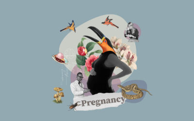
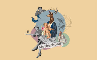
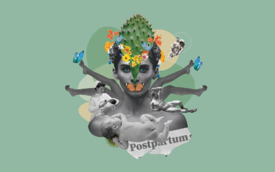
The heart of No Taboo Mom’s design concept lies in its strong, artistic visual communication. The key visual identity was envisioned to not only captivate but also convey the complexity of the topics discussed, using powerful artistic visuals to spark conversation and break taboos. Each piece of artwork we create is a collage—a fusion of vintage images mixed with natural elements and objects that symbolize the subjects at hand. This approach is deliberate: the use of vintage elements represents how some issues concerning women have remained taboo, persisting through time. The collages are bold, thought-provoking, and often abstract, designed to spark conversation and break the silence.
The design concept for No Taboo Mom, including its impactful visuals, was created and art directed by Ewa Gillen in collaboration with graphic designer Golnaz Mohammadi, whose fresh perspective added to the project’s unique aesthetic. Each of our six content categories is identified by a dedicated background color, carefully chosen to align with color psychology principles. This color-coding enhances the user experience, making it easier for readers to navigate and filter content according to their interests. For example:
Motherhood is represented by a soft peach hue, evoking warmth, joy, and energy.
Womanhood uses a soft pink-purple, symbolizing love, kindness, and femininity, balanced with power and spirituality.
Pregnancy is marked by a light, soft blue, associated with health, healing, and tranquility.
These visuals are more than just images; they are a carefully curated blend of art and symbolism, crafted to challenge perceptions and promote understanding.



Website and User Experience
The No Taboo Mom website (notaboo.mom) was designed to reflect our vision of inclusivity and ease of access. Built using WordPress and the Elementor theme builder, the site was art directed by Ewa Gillen and developed by our Elementor expert, Julien Dumas. Together, we created a clean, user-friendly interface enhanced by gentle animations to provide a seamless browsing experience.
We approached the UX and UI design with the aim of ensuring intuitive navigation and accessibility. Our focus was on providing clear pathways to content, simplifying the journey for users while allowing space for impactful visuals. The typography choice—IvY Presto Display for headlines and Mulish for body text—ensures readability and elegance, adding to the overall sophisticated look and feel of the site.

The Logo: Symbolism and Identity
A significant element of No Taboo Mom’s branding is its logo, designed by Lindsay Smith. The brackets in the logo symbolize the unsaid—the words and explanations that often remain hidden in conversations around womanhood. The tilted ‘O’s further represent the non-traditional voices we aim to amplify, encouraging women to speak freely and express their true selves. The logo’s font, Canela-Light, carries an air of elegance, blending contemporary style with classic refinement, reflecting the blog’s approach to timeless yet modern discussions.
A Collective Effort
No Taboo Mom is not just the product of a singular vision; it is the result of a collaborative effort involving both men and women who share the desire to contribute to a greater cause. Our work extends beyond the founders, involving designers, developers, writers, and supporters who believe in the power of honest dialogue.
Honoring the Nomination
Being nominated for the “Project of the Year” in the Impact category by STGU is an honor that not only recognizes our design efforts but also underscores the importance of the conversations we are facilitating. We remain steadfast in our mission to inspire and empower, using design as a tool to drive social change. This recognition strengthens our resolve to continue breaking taboos and building bridges through our visual storytelling.
This article offers a comprehensive overview of No Taboo Mom, its mission, design concept, and the prestigious STGU nomination, showcasing the project as a case study in thoughtful, socially-driven design.




Comments are closed.